‘Hannibal’ on TV: In decorating, he’s a man of good taste
- Share via
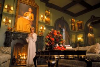
“Hannibal,” the recently renewed NBC drama about psychiatrist-serial killer-cannibal Hannibal Lecter, may be as fiendishly gory as TV gets, but the interior decorating is undeniably elegant. Series creator Bryan Fuller, a partner in L.A. design store Fuller + Roberts, hired production designer Patti Podesta and set decorator Jaro Dick to bring Lecter’s deadly lairs to life.
PHOTOS: The delicious decorating of “Hannibal”
Podesta, whose credits include “Cinema Verite,” provided L.A. at Home with a detailed postmortem via email on the show’s stylish and atmospheric interiors for this edited Q&A;:
What was your design brief, and what were your references?
I remember Bryan Fuller saying first to me, “Elegant horror movie.” He has an immense appreciation for classical order and strange beauty. Nothing is too far out. I put together a group of painter’s images to discuss qualities of spatial articulation, light and color, which included Francis Bacon, Gustave Caillebotte, Andrew Wyeth and Edward Hopper, and Gerhard Richter.
Is Hannibal Lecter’s office a nod to the mix of antiques and modern we’re seeing so much of these days?
He admires beautiful things from all periods, has an eye for things English and European. I suggested Danish Modern, as it has an order of its own. This was well before Mads Mikkelsen was cast as Lecter, so that bit of humor was fortuitous. Bryan’s first script mentioned Sir John Soane’s office in describing Lecter’s. I thought we could rework those qualities having American Gothic overtones via European Art Nouveau.
Hannibal’s desk is an original Leif Jacobsen design purchased from Barry’s in Toronto, where we filmed. The pairing of this midcentury desk and the desk chair, with its ultra-tight leather tucking, is a pretty good description of Hannibal. The gray therapy chairs were ordered new from Urban Barn in Toronto, and the side tables are Eileen Gray classics.
What about Lecter’s home, setting for all his creepy parties?
The office is meant to impress and intimidate; his home is an enclave. He lives in the Baltimore area, and we thought it would be a historic single-family home that masks what goes on inside. So the exterior was to be precise and not too inviting.
Everyone agreed that Lecter would have a superb chef’s kitchen. In keeping with the lavishness of texture that defines all his spaces, the kitchen has barn wood on the appliance wall contrasting with the stainless appliances. And zebra wood on the cabinet wall, masculine and elegant, definitely European. The island in the center is stainless with pale gray leather panels on the front and sides. The counters and backsplash are two different kinds of travertine, solid on counters and the fabulous strata for the backsplash.
Is it a fully functional kitchen?
Yes. All the appliances are from the GE Monogram series. It is important, in high-end kitchens, for all the appliances to match. Since NBC is owned by GE, we thought we could get a good price on these very expensive items. It appealed to me as an in-joke that Hannibal does his work with appliances made by the network. They turned our request down. Mabe Canada Inc., who reps GE in Canada, stepped up and offered us a serious discount, so the appliances cost in the neighborhood of $18,000.
The dining room is to die for. What was the inspiration?
Bryan suggested a living wall for the dining room, and carrying this idea further, I thought to use a landscape as a backdrop. I found this etching online and loved its Gothic tone. It’s by Oscar Grosch and is in the collection of the Staten Island Museum, which granted us permission to use it. It was reproduced as wallpaper, with corresponding strips covering shallow box shelves, floating on the wall.
The plants are all live herbs in containers. The shelves get smaller in size as they rise up the wall because the plants on the lower levels need to receive light in order to survive.
The walls made of moldings were Bryan Fuller’s idea. He had seen them in a restaurant. For ours, I chose moldings that had voluptuous curves. We wanted it to become a singularity, and the color needed to be the indigo of the night sky, without going black on camera. It’s a lighter blue than you would imagine. The stain was a mixture of Minwax custom colors, and the different woods gave it variation.
ALSO:
‘70s style in ‘Behind the Candelabra’
The grandiose design of ‘The Great Gatsby’
The ramshackle house in “The Kings of Summer”
For an easy way to follow the L.A. scene, bookmark L.A. at Home and join us on Facebook, Twitter and Pinterest.
More to Read
The complete guide to home viewing
Get Screen Gab for everything about the TV shows and streaming movies everyone’s talking about.
You may occasionally receive promotional content from the Los Angeles Times.


